
What Makes an Invitation Feel Timeless?
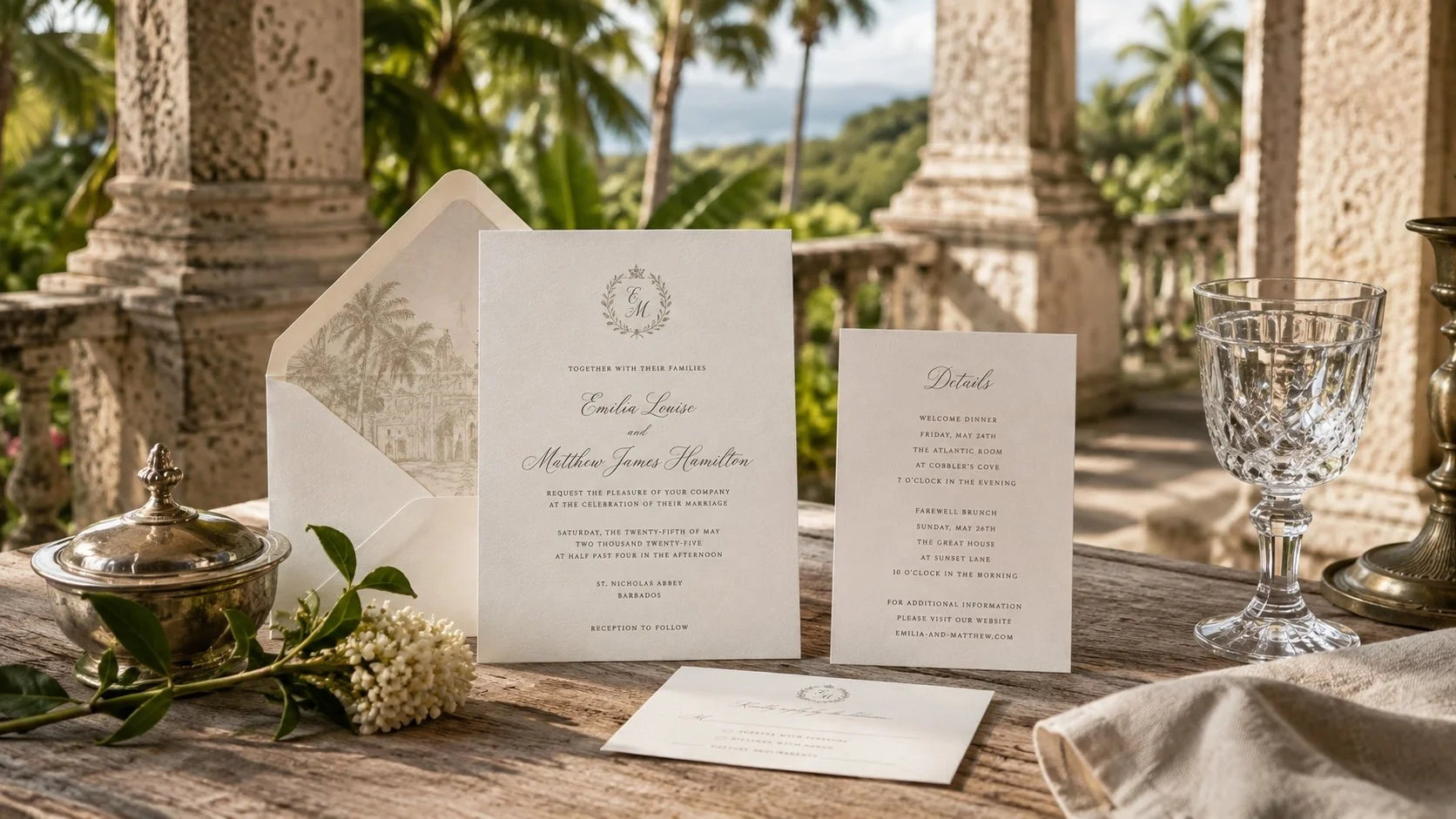
Some wedding invitations belong unmistakably to the moment in which they were created.
Others seem less concerned with announcing when they were designed.
Years later, they still feel beautiful.
That quality is often described as timeless, although the word can be misleading. Timeless does not mean traditional. It does not require ivory paper, black typography, a formal monogram or an absence of color. Nor does it mean avoiding everything contemporary.
An invitation can be expressive, colorful, botanical, architectural, minimal or richly detailed and still possess longevity.
The difference lies less in a particular aesthetic than in the decisions behind it.
When beauty depends primarily upon something being fashionable, it may fade with the fashion. When it grows from proportion, typography, materials, craftsmanship and details considered as a whole, it has a stronger foundation.
So what should you look for?
Begin With Proportion
Before noticing a typeface, illustration or color palette, you are already responding to proportion.
The size of the invitation. The relationship between its width and height. The amount of space surrounding the wording. The position of one element in relation to another.
These decisions are quiet, but they establish order.
Good proportion allows an invitation to feel composed before the reader consciously understands why.
It can also create character.
A generous margin may lend a design formality and calm. A smaller card can feel intimate. An unusual proportion can feel distinctive when there is a reason for it rather than simply a desire to be different.
This is one reason enduring design rarely begins with decoration.
It begins with structure.
When the underlying proportions are right, everything placed within them has somewhere to belong.
Let Typography Do More Than Decorate
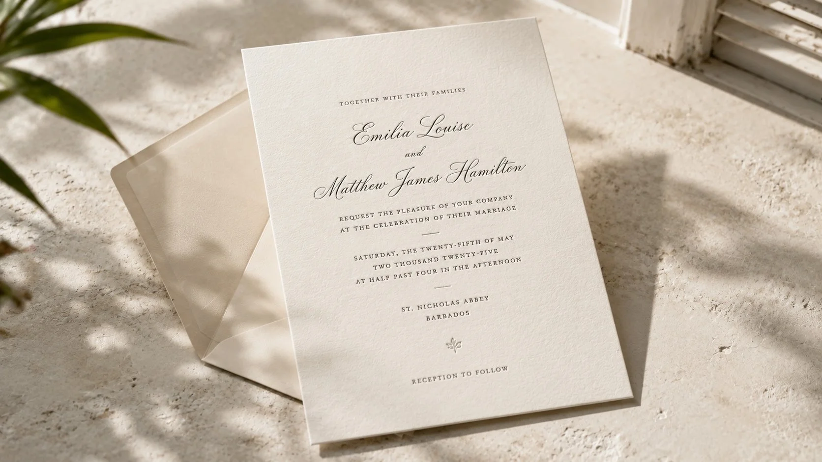
Typography carries much of an invitation's personality.
It can make the same words feel ceremonial, romantic, restrained, exuberant or contemporary.
But beautiful typography is not simply the selection of a beautiful font.
It is the relationship between typefaces. The scale of the names compared with the supporting information. The spacing between lines. The width of the text. The hierarchy that tells the eye what to read first and what to read next.
The most successful invitations do not ask every line to be important at once.
They establish rhythm.
That may mean allowing names to command attention while the remaining information becomes quieter. Or using a script sparingly so that its presence feels meaningful rather than ornamental.
When typography is handled well, it becomes part of the architecture of the invitation.
The words are not merely placed upon it.
They help create it.
Give Every Detail a Reason to Be There
Decoration is not the enemy of timelessness.
Arbitrary decoration is.
An illustration, border, crest, pattern or flourish can give an invitation extraordinary character. The question is what that element contributes.
Perhaps an illustration refers to the architecture of the venue. A botanical detail echoes something growing in the landscape. A border establishes formality. A motif carries meaning particular to the couple or celebration.
Not every element needs an elaborate story.
But each should feel intentional.
The test is not whether another detail could be added. It is whether the one already there has earned its place.
When details accumulate simply because they are fashionable, the invitation begins to depend upon the fashion for its identity.
When they belong to the composition, they can outlive it.
Understand the Power of Restraint
If thoughtful detail asks why an element belongs, restraint asks when the design has enough.
Restraint is sometimes mistaken for minimalism. They are not the same thing.
A richly illustrated invitation can exercise restraint. So can one filled with color or ornament.
Restraint might mean resisting another flourish because the first one is doing its job. Not introducing another typeface when the existing ones already establish the necessary hierarchy. Not filling an empty area merely because it is empty.
White space is not unfinished space.
Often, it is what allows everything else to be seen.
This is particularly important when an invitation contains beautiful materials, typography or illustration. Giving those elements room can make them feel more significant, not less.
Restraint allows the eye to understand what matters.
Choose Materials That Support the Design
An invitation is one of the few elements of a wedding that guests experience before they arrive.
And unlike much of what they will encounter later, they hold it.
Paper has weight. Texture. Rigidity. Softness. Sometimes even a particular sound as an envelope is opened or a card is lifted from within it.
Those qualities contribute to the experience.
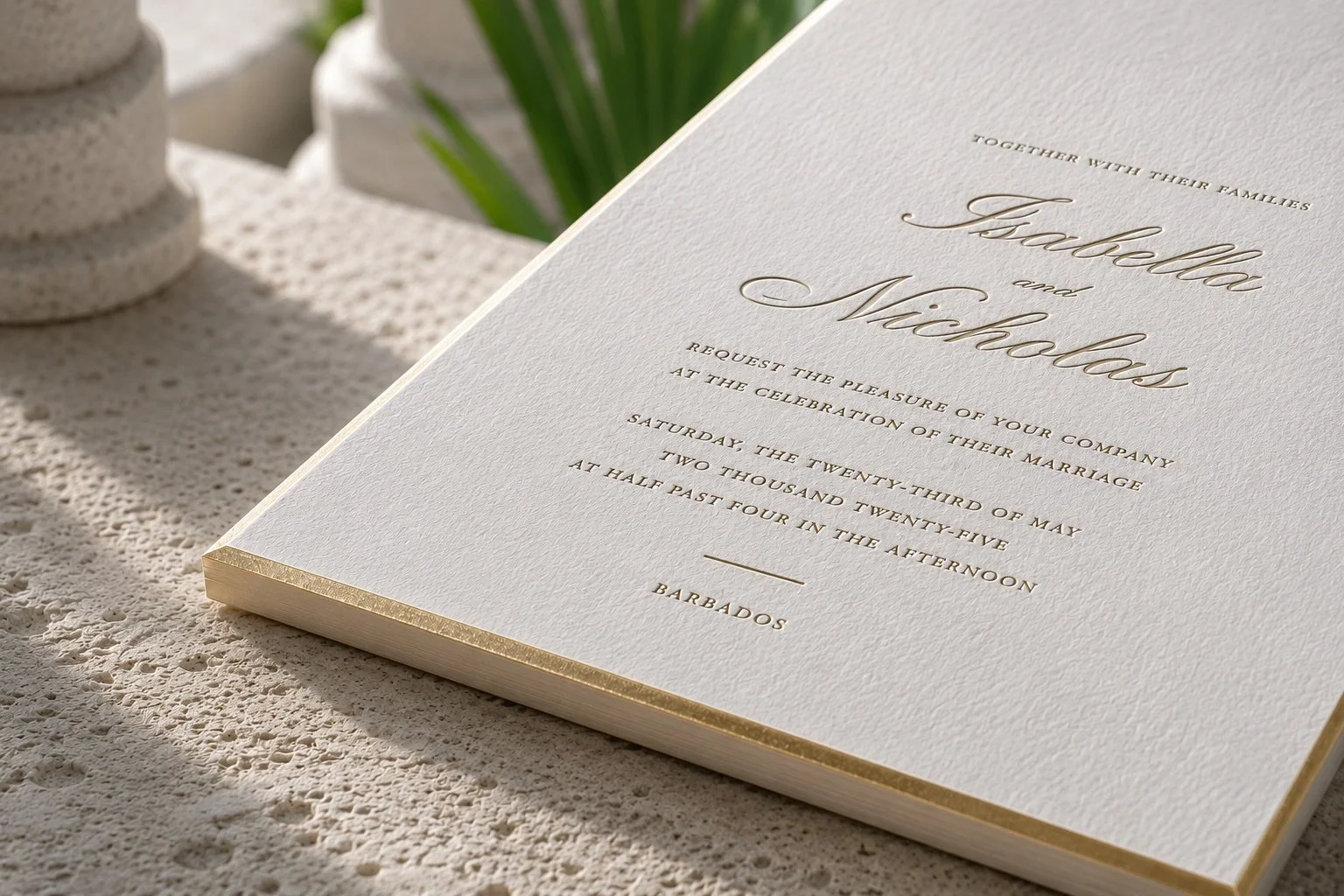
A substantial cotton stock designed to accept impression may suit an invitation whose character depends upon depth and tactility. A smoother paper might allow fine illustration or color to reproduce beautifully. Letterpress, foil, embossing and other production methods can introduce depth, light or texture when they serve the composition rather than becoming spectacle for its own sake.
More expensive does not automatically mean more beautiful.
The question is whether the materials and production choices belong together.
The best craftsmanship rarely needs to announce itself.
You notice it because the invitation feels resolved.
Allow Color to Belong to the Celebration
A timeless invitation does not need to be neutral.
Color can give stationery tremendous character.
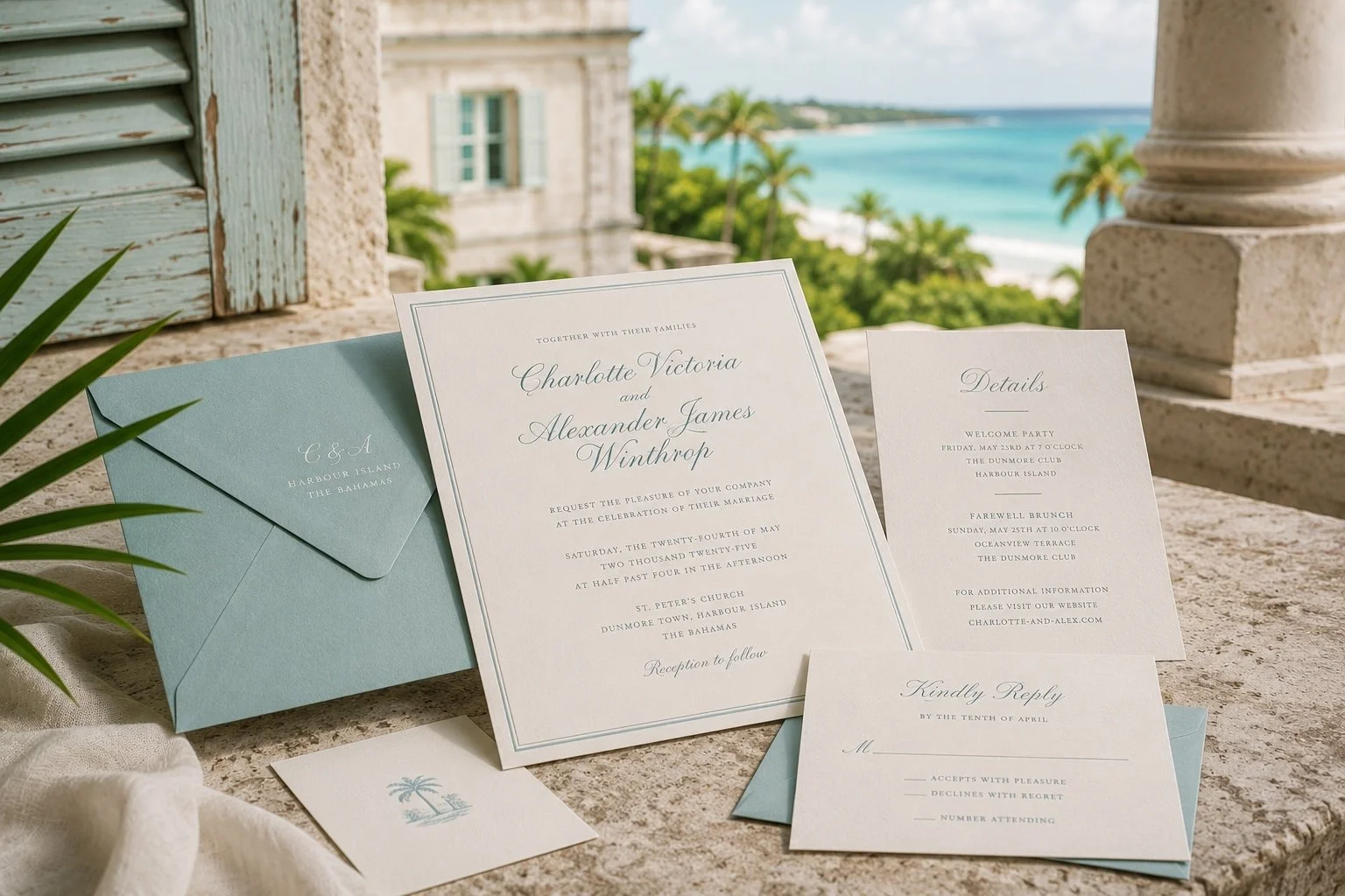
But there is a difference between choosing a color because it is currently everywhere and choosing one because it belongs naturally to the world of the wedding.
Look beyond the year's popular palettes.
Consider the landscape. The architecture. The season. The quality of the light. The materials already present at the venue.
A faded coral might feel at home against weathered Caribbean stone; a deep green might find its reason in an established tropical garden.
The aim is not to reproduce the venue literally.
It is to allow the setting to inform the visual language of the celebration.
Color chosen with that kind of context tends to feel less arbitrary—and therefore less disposable.
Personal Does Not Have to Mean More
Couples naturally want their invitations to feel like their own.
That does not require adding every symbol, interest, flower, destination reference or shared memory to a single piece of paper.
Sometimes personalization is quieter.
It may be a color chosen because of the setting. An illustration of an architectural detail. A particular wording style. A monogram drawn specifically for the couple. A material selected because its character suits the celebration.
The strongest personalization often feels discovered rather than applied.
It belongs so naturally within the composition that removing it would make the invitation feel less complete.
That is very different from customization for its own sake.
The goal is not to prove that an invitation is unique.
It is to make it feel unmistakably right.
Be Careful With the Word “Classic”
Classic and timeless are often used interchangeably.
They are not quite the same.
A classic invitation may draw deliberately from established traditions: centered typography, formal wording, restrained color, engraving or letterpress, perhaps a crest or monogram.
Those conventions have endured for good reason.
But timelessness is not dependent upon them.
A contemporary invitation can possess the same longevity when its proportions, typography, materials and details have been handled with equal care.
Conversely, adopting traditional elements does not automatically make an invitation timeless.
A poorly proportioned invitation remains poorly proportioned in ivory and black.
What matters is not whether the design belongs to a particular category.
It is whether the decisions within it belong together.
Look for Coherence
Perhaps this is the quality that matters most.
A beautiful invitation should feel as though its elements are in conversation with one another.
The typography suits the illustration.
The illustration suits the proportion.
The proportion suits the amount of information.
The paper supports the printing method.
The color belongs to the setting.
Nothing seems to have wandered in from another design simply because it was attractive on its own.
Historic places often possess this quality naturally.
Their materials, proportions, landscape and architecture have developed a relationship over time. What makes them compelling is not necessarily any single beautiful feature, but the way those features belong together.
An invitation can achieve something similar on a much smaller scale.
Its beauty comes from the whole.
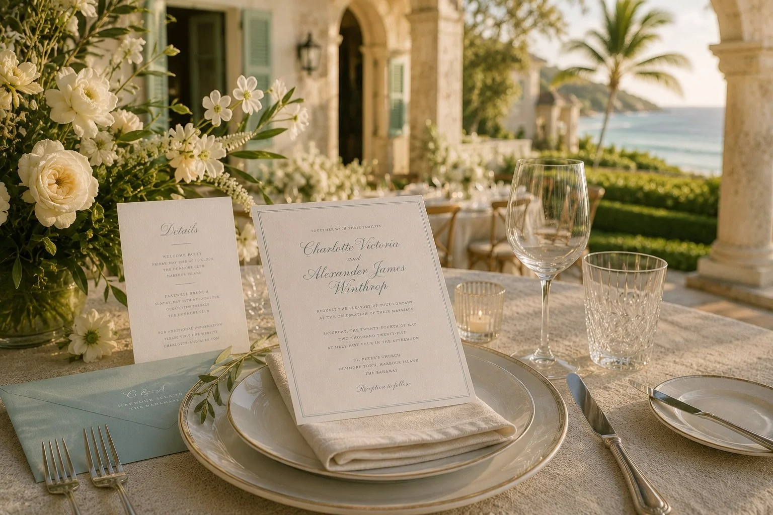
Before You Choose, Look Beyond the First Impression
When evaluating an invitation, notice what attracts you first.
Then look again.
Forget the tablescape, ribbon, flowers and carefully arranged flat lay.
Look at the invitation itself.
Are the proportions beautiful?
Does the typography feel considered?
Is there hierarchy?
Do the decorative elements have purpose?
Do the materials support the composition?
Does it feel connected to the celebration it is announcing?
And perhaps most importantly:
If you encountered this invitation years from now, would its beauty still make sense?
No wedding design exists entirely outside its time.
Nor should it.
The colors you choose, the flowers you love and the details that delight you will inevitably say something about the moment in which you married. That is part of their charm.
The aim is not to create something without a date.
It is to create something worth keeping after that date has passed.
Because timelessness is not about making an invitation look as though it could have belonged to any wedding.
It is about designing one thoughtfully enough that, years later, it still belongs beautifully to yours.